When it comes to color in the garden, what pops into your mind? A cheerful mix of bright, jewel-toned blooms? A serene swath of quiet pastels? Maybe a signature color that runs throughout the landscape or the simple elegance of an all-white garden?
Color creates a mood or feeling, whether it’s used in interior room design or outside in your landscape setting, so when you’re planning your landscape design colors, start by asking yourself how you want to feel in this space; relaxed? Energized? Do you want your landscape to be a backdrop to other elements of your yard such as an outdoor kitchen, patio, pool, or sculpture, or perhaps take center stage as a focal point for your outdoor living?
In our upcoming posts, we’re going to be exploring how to use color in the garden to create an outdoor space you’ll love. One of the best places to start, is understanding some color fundamentals, including the color wheel.
Color 101
You may remember from school that there are 3 primary colors: red, yellow and blue.
When pairs of these colors are mixed together in equal proportions, you get 3 more colors known as secondary colors; orange (red+yellow), green (yellow+blue) and violet (blue+red).
Taken a step further, you’ll find 6 tertiary colors. These are secondary colors which have been mixed with a primary color, creating red-orange, yellow-orange, yellow-green, blue-green, blue-violet, red-violet.
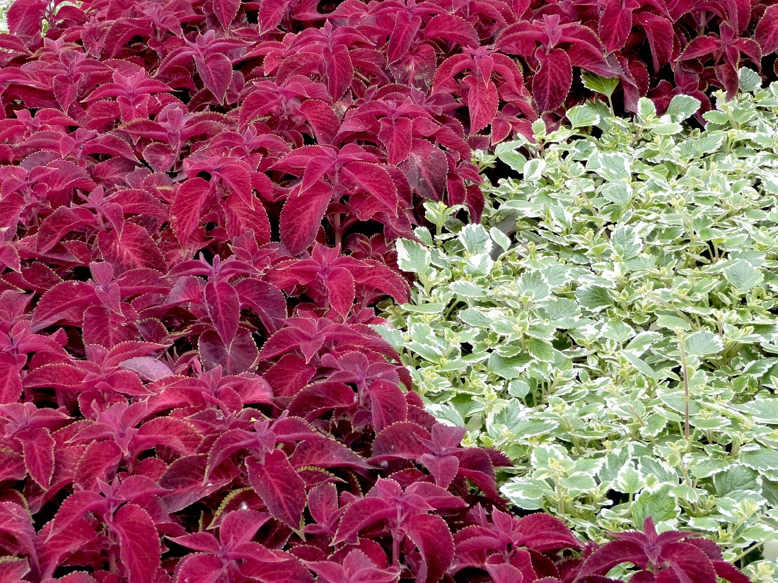
The combinations of these colors in varied amounts creates the broad color spectrum we can detect as humans (around a million colors). The ability to perceive color (which is a function of light) varies by individual and is affected by a myriad of external factors, from light source and intensity, to the number of color rods and cones we have in our eyes, certain medications we may be taking, whether or not we are fatigued, and even if we have language that helps us define a color. Because color is a function of light, it has a certain energy. On the color wheel, the further colors are away from each other, the more contrast/energy they have when used together. For instance, red and green are on opposite ends of the color wheel. In the supermarket, you’ll often see packages of meat set in cases with green backgrounds. The contrast between the two colors intensifies the color of each, so the red in the meat looks more intense, which makes it appear fresher to us.
Using the color wheel, we’ll be covering 4 basic color palettes: monochromatic, analogous, triad and complementary.
Moods of Color Palettes
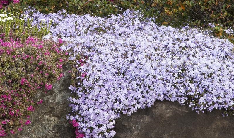
Monochromatic – Soothing, elegant simplicity. Monochromatic gardens focus on a single color (not necessarily a single plant). Think all-white or single-hued gardens such as pastel pinks, lavender, or even all green/foliage gardens. Conversely, single swaths of color can make a dramatic statement in the garden, particularly when using vibrant hues such as red, orange or yellow.
Analogous – Calming and harmonious. These are colors immediately adjacent to a color (usually a primary or secondary color). For instance, a yellow analogous garden might include colors that range from an almost creamy white, to soft butter, a true sunny yellow, soft peach, terra cotta and orange. A blue garden could include blooms that range in hue from a true blue lobelia, to a gentian-violet.
Triad – Balanced, energized, uplifting and vibrant. As the name implies, these are 3 colors that are equidistant on the color wheel, like yellow/blue/red, or orange/purple/green or aqua/peach/red-violet.
Complementary – For the most intense contrast/highest energy, opt for complementary color pairings – those directly opposite from one another on the color wheel, like red and green; yellow and purple; or blue and orange. With the popularity of black as a color trend for 2022 (See our recent post – Proven Winners’ New Plants for 2022) you might also want to consider a black and white garden for dramatic flair.
In upcoming blog posts, we’ll be showing you different gardens using these various color palettes along with specifying our favorite plants by color to help inspire you. Naturally, here at Farmside, we’re here to help you any way we can, from simple plant and color-pairing suggestions to complete garden design and implementation.
Main image credit – PixaBay